Our first assignment in art class this trimester was making a logo for our website. We eventually make stamp blocks from them, but that's a blog post for later.
Every logo has it's special quality, but sometimes you have to dig to find it. I had to make four different designs before I could really choose the one that spoke to me.
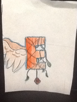
So, my logo was a big letter E with a unfurled wing. The E itself was covered in vines and ha a gem hanging from the bottom. Wow, what a lot of stuff in a little logo.
What every logo needs is a meaning. Each aspect of my logo has just that. The E is rather obvious because it is my fist initial. The wing represents me because I always have my head in the clouds. The vines mean I am a wild person, even if I don't always show it. The gem is because I am a special find; I have great qualities even when I beat myself down.
,
Every logo has it's special quality, but sometimes you have to dig to find it. I had to make four different designs before I could really choose the one that spoke to me.
So, my logo was a big letter E with a unfurled wing. The E itself was covered in vines and ha a gem hanging from the bottom. Wow, what a lot of stuff in a little logo.
What every logo needs is a meaning. Each aspect of my logo has just that. The E is rather obvious because it is my fist initial. The wing represents me because I always have my head in the clouds. The vines mean I am a wild person, even if I don't always show it. The gem is because I am a special find; I have great qualities even when I beat myself down.
,